Product Design · Cross-brand Alignment · Motion · Usability Research
Canada’s leading loyalty program, with Scotiabank & Tangerine.
One Shared Template: 3 Unique Identities



 Scene+

 Scotiabank

 Tangerine Scene+ Scotiabank Tangerine
Welcoming a
SECOND BANK
For years, Scene+ members have earned more through its partnership with Scotiabank. When Tangerine joined as a second banking partner, Scene+ faced a new challenge: creating a trusted card-finding experience that could serve both partners without favoring one over the other. The existing card finder, owned by the bank and embedded within the Scene+ site, wasn’t built for what Scene+ needed next.
 Scotiabank Tangerine Joining
Aligning Multiple Stakeholder Groups
Four priorities, one vision.
Scene+ Priority
Trust transfer and earn acceleration
Carry members’ trust in Scene+ through to its bank partners, and make point acceleration click as a concept: the same points, collected faster.
Scotiabank’s Priority
The breadth of the offering
Showcase the full range of Scotiabank cards and their perks, each card leading with a different standout benefit.
Tangerine’s Priority
One card, flexible benefits
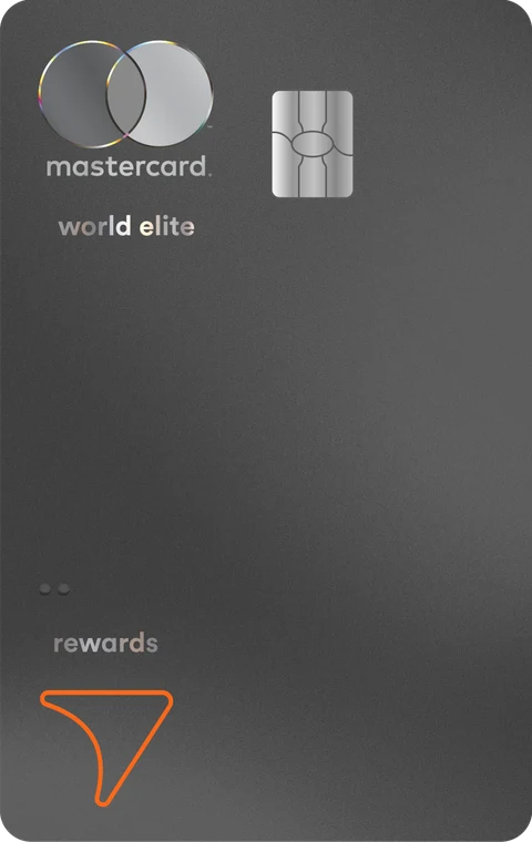
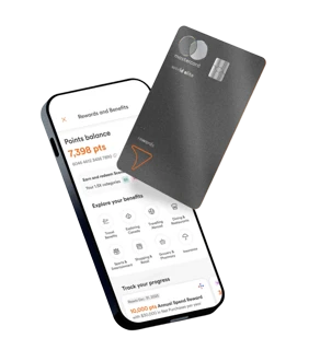
Highlight its single card and the flexibility that sets it apart: members choose their own reward categories.

Our approach
A vision that performs
Our job was to bring every group’s priorities into one cohesive experience, while making the page perform: sending more members to the bank partners.
Scene+ Priority Trust transfer and earn acceleration


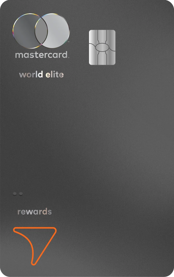
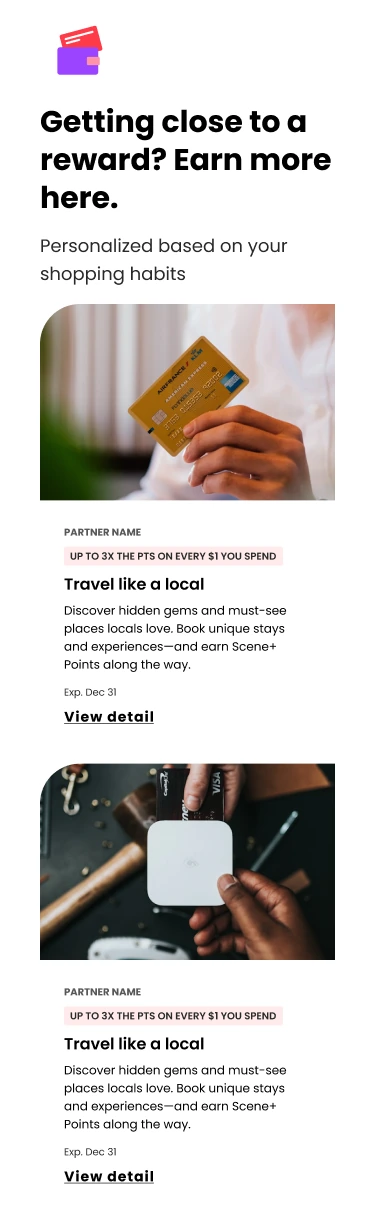
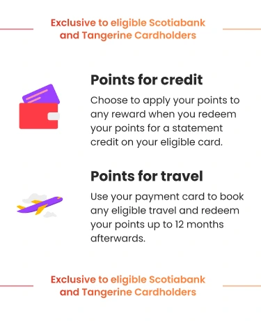
 Eligible payment cards unlock more ways to earn




 Scotiabank’s Priority
The breadth of the offering
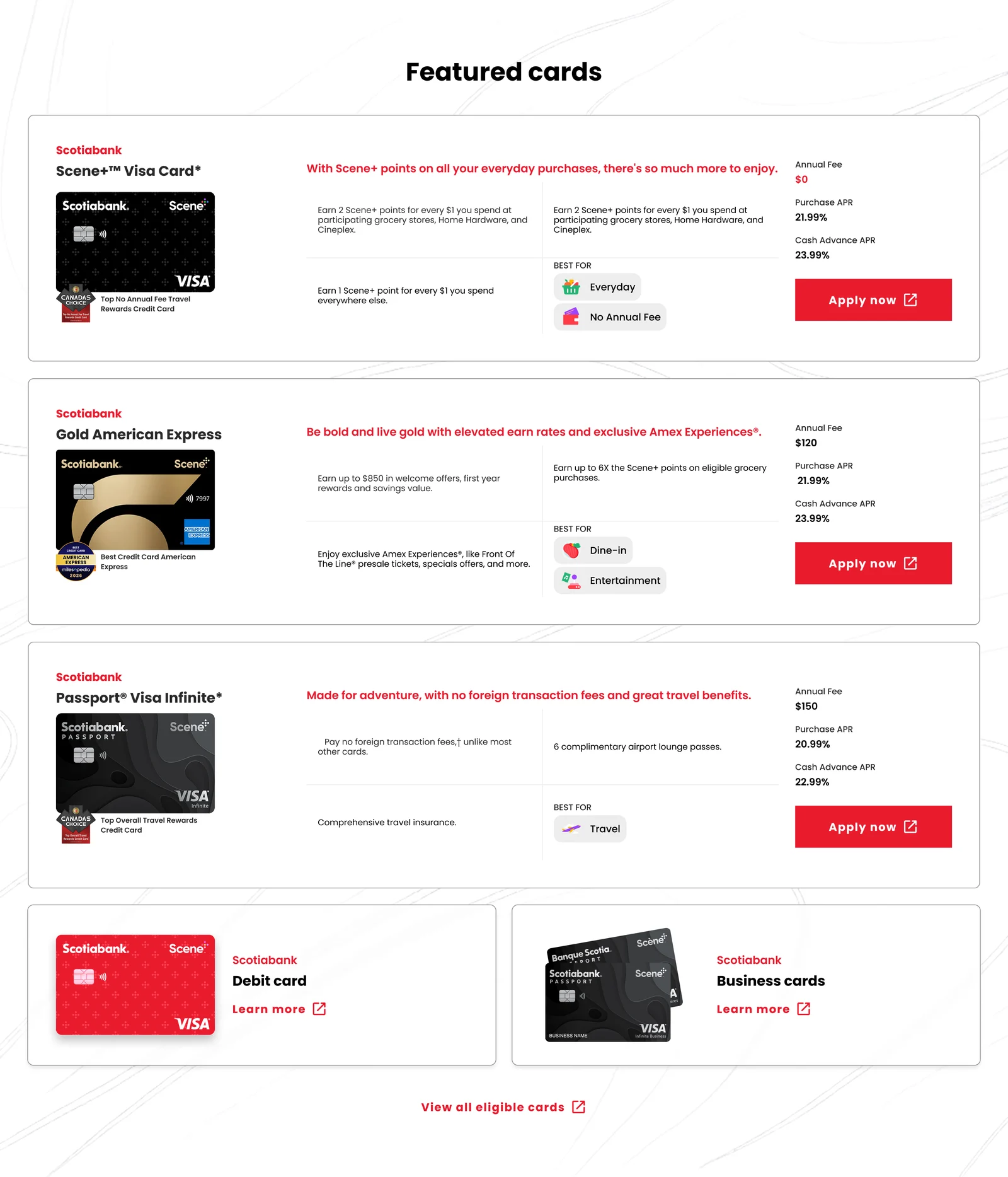
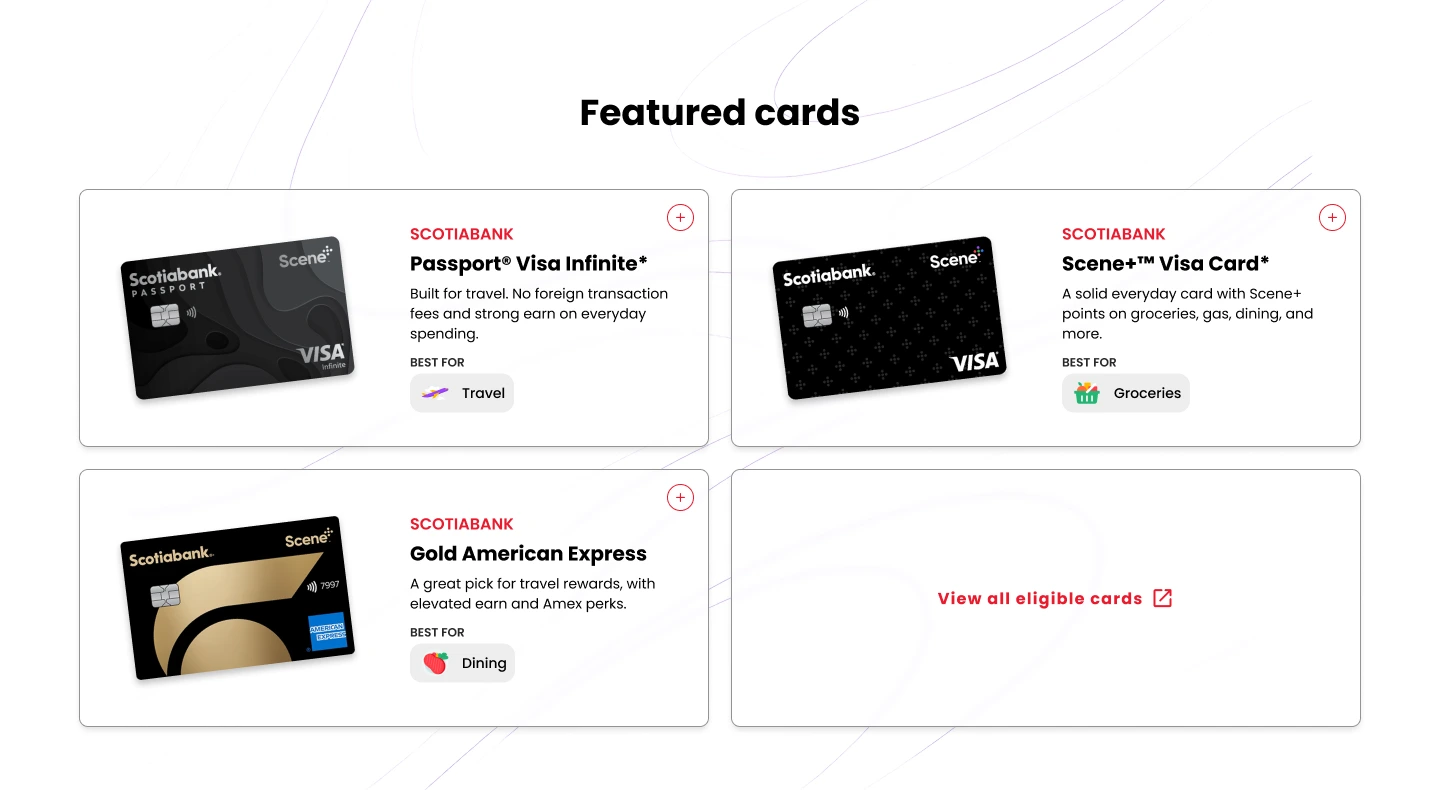
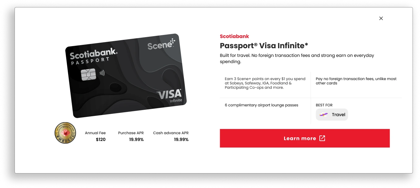
Scotiabank brings several cards to the program, each with distinct benefits to showcase. The challenge was making every card visible without overwhelming members. To find the right balance, we tested two approaches: a flat layout with all card details displayed upfront, and a streamlined grid that reveals each card’s details in a modal.
Motion as the Mechanism
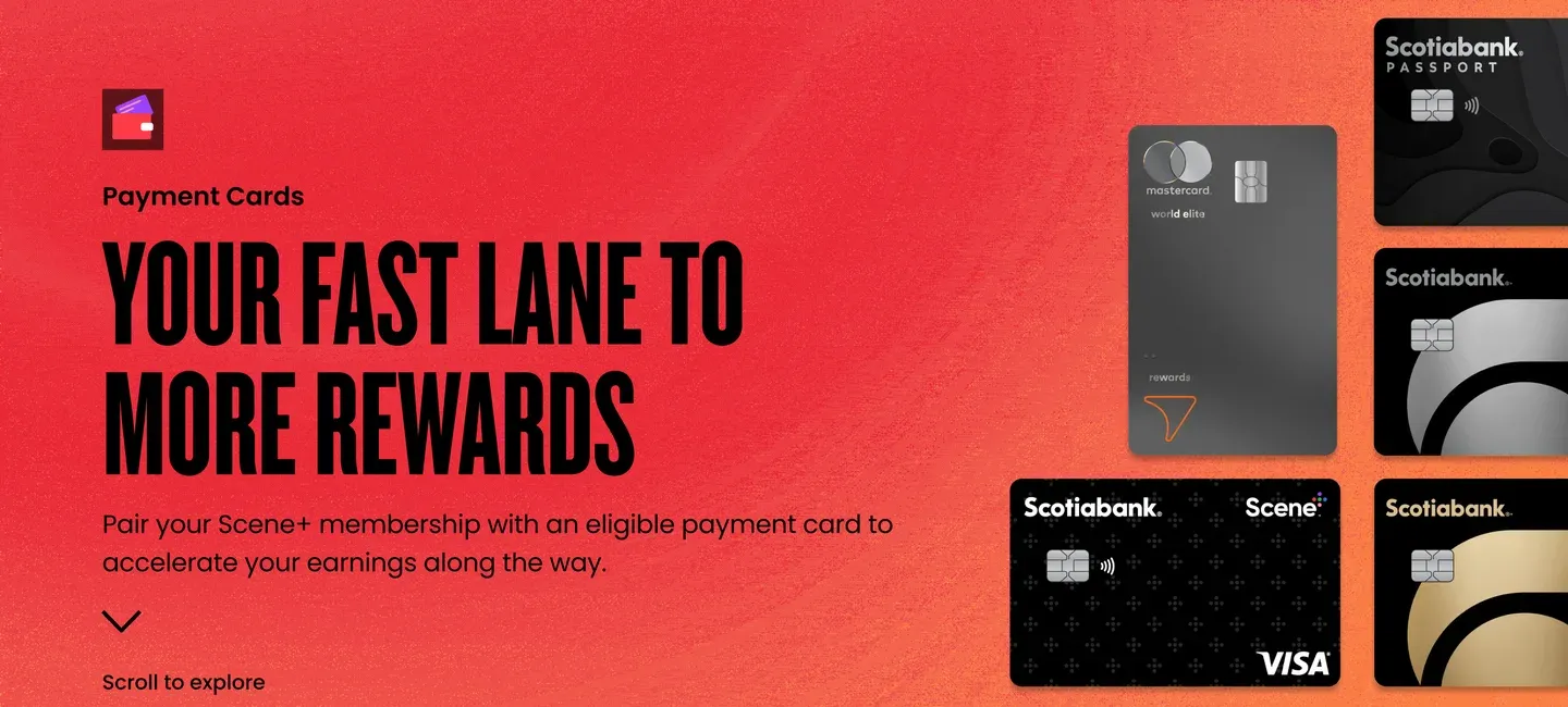
The flat layout settled how members compare cards, but the heroes had a different job: show how the pieces fit together. Static images could only show one card at a time, so we built a motion system and tuned it three ways: to show the banks’ relationship to Scene+ and to each other, the breadth of Scotiabank’s lineup, and a solo moment for Tangerine’s single card.

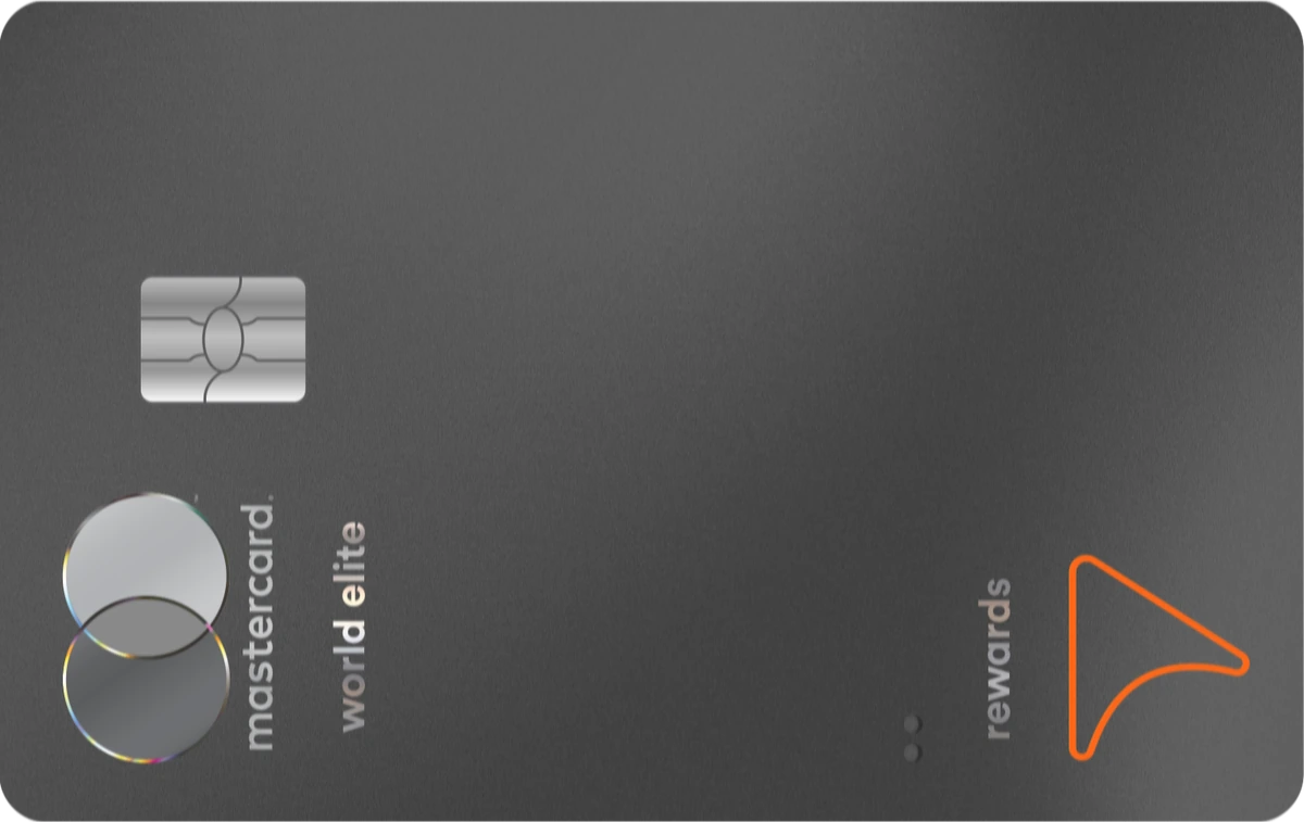



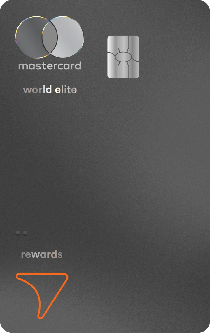 Tangerine’s Priority
One card, flexible benefits




 Our approach
A vision that performs
Aligned together
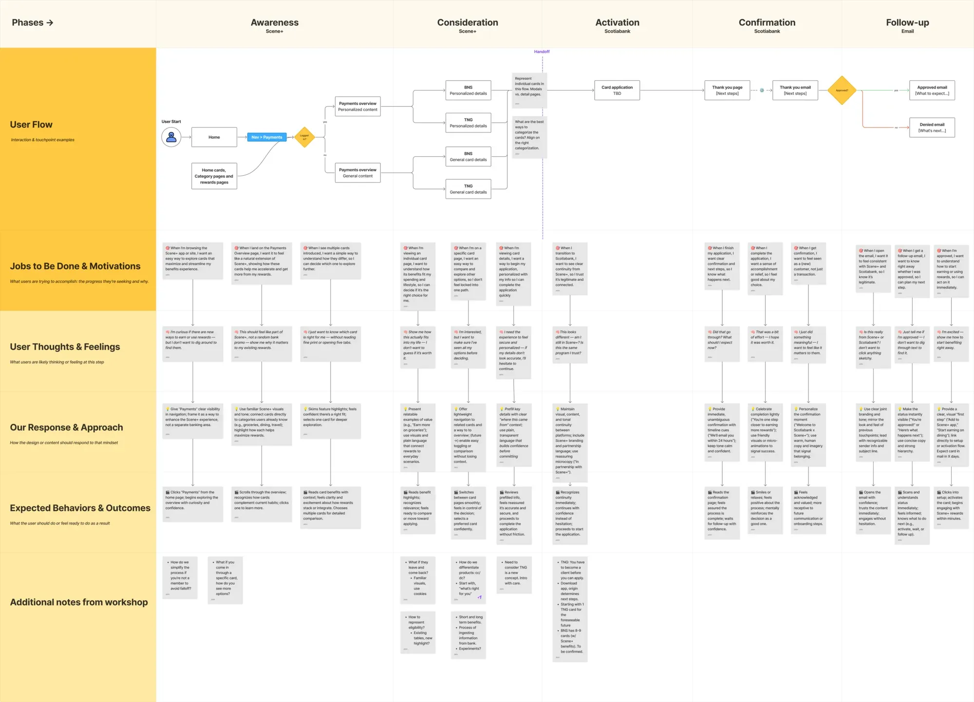
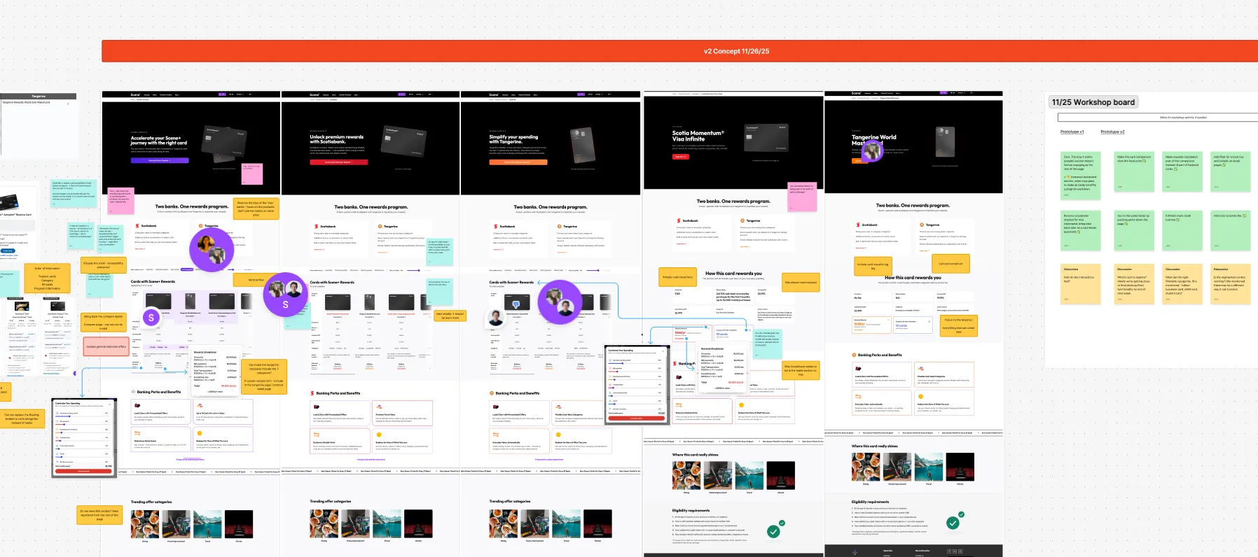
We began with a user flow that everyone could agree on and used a shared board for every concept round throughout the project.
Explored in the open
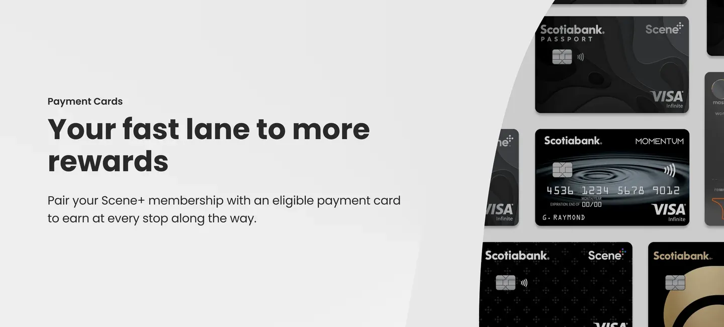
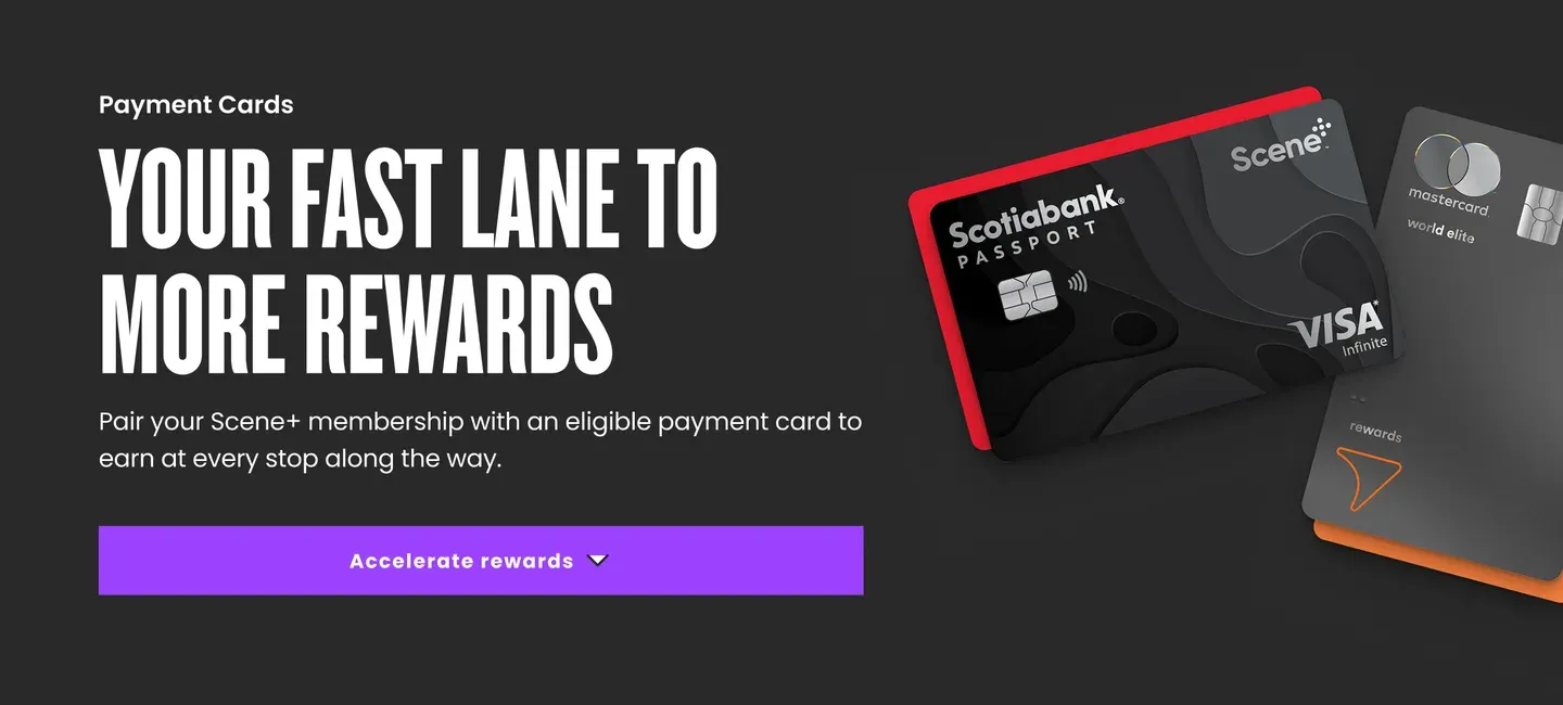
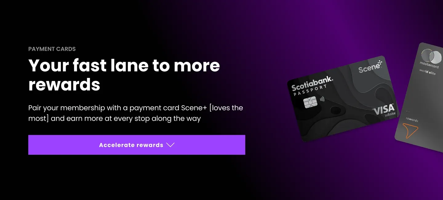
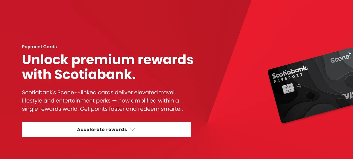
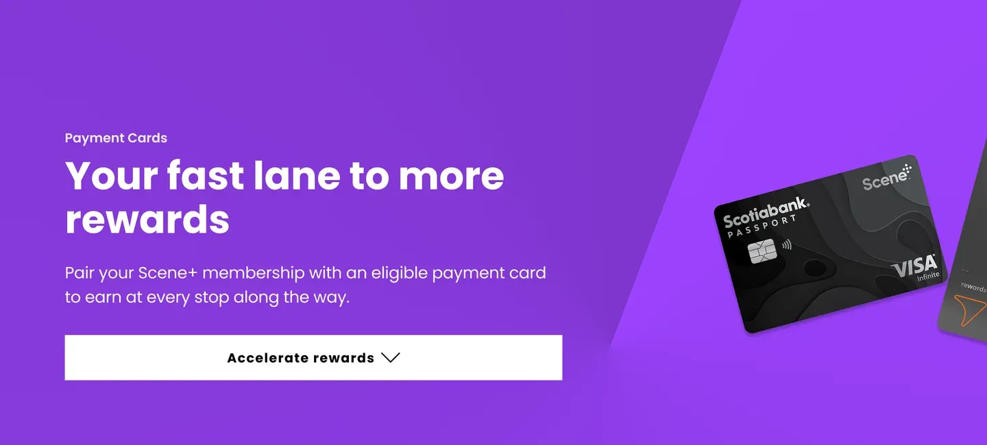
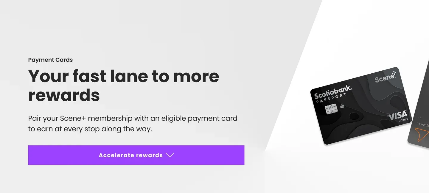
Eight hero directions, reviewed together. The stakeholders chose the last: both cards, side by side, on a Scene+ purple swirl.

Built to perform
The impact was measured in referrals. Comparing the new Scotiabank page’s performance against the original.
Banking · New Scotiabank page
+221% clicks to Scotiabank
+188% page views